Measuring Claude Code Adoption at the Org Level
So, you’ve deployed Claude Code to your engineering organization. Developers are using it, tokens are being consumed. How do you measure how much it’s actually being used?
I ran into this myself. I had already built claudefana as a personal observability dashboard for Claude Code, tracking my own spend, cache efficiency, cost per commit, that kind of thing. I wrote about it in claudefana: Beyond the Burn Rate. Building that got me deep into Claude Code’s OpenTelemetry data and I started to see how much useful signal was in there.
When I looked at making this work for my engineering organization, I realized the OTEL data alone wasn’t enough. It tells you who used it and what it cost but it doesn’t tell you who they report to, what team they’re on, or what tickets they closed. I needed to join it with data from other systems to make it useful at the org level.
When I started looking into how to measure this, I found Anthropic’s Claude Code ROI guide that frames adoption measurement around 5 business questions. It gives you the right questions to ask and pseudocode for how to answer them, but the actual answers depend on your organization’s context, who reports to whom, what teams people are on, what tickets they’re closing.
I built claudefana-enterprise to bridge that gap. It layers two custom exporters on top of Claude Code’s OpenTelemetry data, one pulling org structure from Microsoft Graph and another pulling work data from Jira/Tempo. Both wire into Grafana dashboards that answer the guide’s 5 questions with your org’s actual data.
The 5 Questions
The guide structures adoption measurement around these questions:
- What’s our ROI per developer?
- Does experience level change effectiveness?
- Should we switch pricing models?
- Where are teams getting stuck?
- Is Claude Code making us faster at fixing bugs?
Each one sounds simple but needs data from multiple systems to answer properly. Claude Code’s OTEL metrics tell you who used it and what it cost, your org chart tells you roles and reporting lines, your issue tracker tells you what work got done.
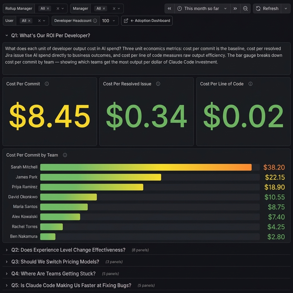
Q1: What’s Our ROI Per Developer?
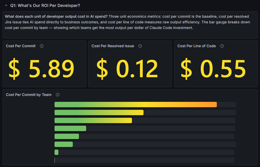
What does each unit of developer output cost in AI spend? Three unit economics metrics: cost per commit is the baseline, cost per resolved issue ties AI spend directly to business outcomes, and cost per line of code measures raw output efficiency. The bar gauge breaks down cost per commit by team, showing which teams get the most output per dollar of Claude Code investment.
The guide focuses on cost per commit and cost per line of code. The cost per resolved issue panel goes further, it joins Claude Code cost data with Jira resolution counts so you’re tying AI spend to work that actually closed, not just code activity.
Q2: Does Experience Level Change Effectiveness?
Do certain roles get more value from Claude Code than others? Job title (from Microsoft Graph) serves as a proxy for seniority. Acceptance rate (lowest-first) highlights roles rejecting suggestions most, total cost shows where money goes, cost per commit reveals which roles produce the cheapest output. Average prompt length and short prompt ratio by role identify coaching targets, roles writing short, low-effort prompts get worse results.
The guide suggests correlating tool acceptance rates with developer experience data to see which roles get the most value and where training investment pays off. Claude Code’s telemetry doesn’t include anything about the developer’s role or seniority, so the Graph enrichment exporter pulls job title from Microsoft Graph and uses it as a proxy for experience level.
The dashboard slices three metrics by role: code edit acceptance rate (sorted lowest-first to highlight roles that reject suggestions most), total cost (where the money goes), and cost per commit (which roles produce the cheapest output). Roles at the bottom of the acceptance chart are the ones struggling most with Claude’s suggestions.
I added prompt quality panels too, average prompt length and short prompt ratio by role. Roles writing short, low-effort prompts tend to get worse results and show up as the best coaching targets. It doesn’t expose what anyone typed, just how much.
Q3: Should We Switch Pricing Models?
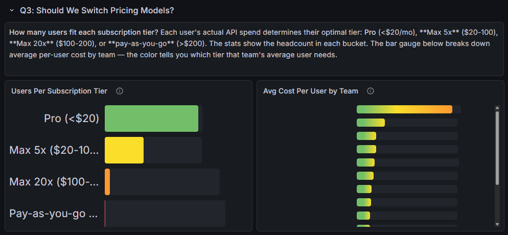
How many users fit each subscription tier? Each user’s actual API spend determines their optimal tier: Pro (<$20/mo), Max 5x ($20-100), Max 20x ($100-200), or pay-as-you-go (>$200). The bar gauge breaks down average per-user cost by team, the color tells you which tier that team’s average user needs.
This one is straightforward but I’ve seen orgs overpay on it. The dashboard buckets each user’s actual API spend into the subscription tier that would be cheapest for them: Pro (<$20/mo), Max 5x ($20-100), Max 20x ($100-200), or pay-as-you-go (>$200).
The bar gauge on the right shows average cost per user by team with color-coded thresholds matching the tiers. You can see at a glance whether a team’s average user fits Pro or needs Max.
Q4: Where Are Teams Getting Stuck?
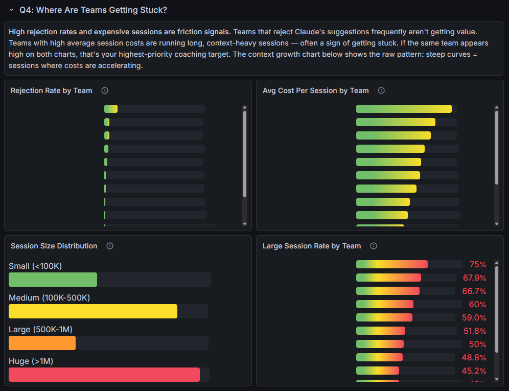
High rejection rates and expensive sessions are friction signals. Teams that reject Claude’s suggestions frequently aren’t getting value. Teams with high average session costs are running long, context-heavy sessions, often a sign of getting stuck. If the same team appears high on both charts, that’s your highest-priority coaching target.
The session size distribution adds another layer, bucketing sessions by context window size from small (<100K tokens) to huge (>1M). The large session rate by team shows what percentage of each team’s sessions exceed 500K tokens. Teams at the top of that chart should be starting new sessions more frequently, and if they also show high rejection rates, that’s your first coaching target.
Q5: Is Claude Code Making Us Faster at Fixing Bugs?
Are tickets getting resolved faster with Claude Code? Median resolution time by team shows which teams close issues quickest. Resolution by priority reveals whether high-severity bugs are being fixed fast. Cost per resolved issue by team ties AI spend directly to business outcomes, lower means more bug fixes per dollar. The distribution shows the org-wide resolution speed profile.
This is the hardest one to instrument. Claude Code knows sessions and cost, Jira knows resolution times, so the Jira exporter had to bridge them.
I extended the Jira exporter to emit a resolution time histogram, the time from issue creation to resolution in hours, with 12 buckets ranging from 1 hour to 30 days. The dashboard shows median resolution time by team and by priority, plus cost per resolved issue by team.
There’s also a resolution time distribution that buckets all issues into speed categories: fast (<1 day), normal (1-3 days), slow (3-7 days), very slow (1-2 weeks), and stalled (>2 weeks).
The Missing Context
claudefana-enterprise bridges the gap with two custom Prometheus exporters.
Graph Enrichment Exporter
This one connects to Microsoft Graph and enriches every Claude Code user with org metadata. It queries Prometheus to discover which users have Claude Code telemetry (no static user lists to maintain), then fetches each user’s Graph profile and management chain.
The interesting part is the rollup manager resolution. It walks up the management chain until it finds someone whose boss is a CxO, and that becomes the “rollup” label. This gives you a VP-level grouping for every user in the org without anyone having to configure it manually.
The exporter emits a user_info gauge with 13 labels (department, job title, manager, rollup manager, office, country, etc.) that acts as a universal join key in PromQL. Dashboard panels use it to filter any Claude Code metric by department, role, team, or manager.
Jira/Tempo Exporter
Same auto-discovery pattern. Finds Claude Code users in Prometheus, resolves their Jira usernames, then pulls issues resolved, issues created, story points, and resolution time from Jira, plus worklog hours from Tempo.
The resolution time comes out as a Prometheus histogram with 12 time buckets (1 hour to 30 days), which is what powers the Q5 MTTR panels. The Tempo worklogs enable an AI-time vs billable-time ratio, how much of a developer’s tracked time correlates with Claude Code sessions.
Kubernetes Deployment
The whole stack deploys to Kubernetes via Kustomize. The base includes 6 deployments (OTEL Collector, Prometheus, Loki, Grafana, and both exporters), 6 services, 2 PVCs, and ConfigMaps.
It’s parameterized so you can customize it for your cluster. Secrets for Graph and Jira credentials, storage class for your volumes, ingress as a template you fill in for your controller. Overlays handle the rest, SSO config, hostnames, TLS.
It also includes 10 Prometheus alert rules covering usage warnings (70%, 85%, 95% of rate limits), burn rate alerts, cache efficiency drops, and exporter health checks.
Three Dashboards
claudefana-enterprise ships with three dashboards:
Adoption (40+ panels) is the main one. Adoption rate gauge, org hierarchy tree visualization, a developer scorecard table, cost breakdowns by department, usage trends over time. This is the one you’d put on a TV in the office.
User Explorer (20+ panels) is a per-user deep-dive linked from the adoption dashboard. Click a user’s name and you see their cost over time, session patterns, tool usage, model mix, edit behavior.
ROI Analysis (25+ panels) is organized around the guide’s 5 questions, one dashboard row per question.
Adoption vs. Impact
Everything here measures adoption, not causation. It tells you which teams are resolving quickly, which roles get the most value, and what it costs, but it doesn’t prove that Claude Code caused those outcomes. Impact questions like “are we shipping faster?” or “is code quality improving?” need before/after baselines and longer time horizons, and that’s a harder problem I haven’t solved yet.
Try It
This is how I solved the problem for my org, Microsoft Graph for the org chart, Jira/Tempo for the work data. Your organization’s context will be different. Maybe you use Okta instead of Graph, or GitHub Issues instead of Jira. The questions are the same, the data sources will vary.
claudefana-enterprise is open source: github.com/JuanjoFuchs/claudefana-enterprise. The README covers setup for both Docker Compose and Kubernetes. The repo has an AGENTS.md and documentation that Claude can use to understand the architecture, so you can fork it, point Claude at it, and adapt it to your own systems.
Anthropic’s ROI guide is here: claude-code-monitoring-guide.
If you’re looking for the personal version (single user, no org context), that’s claudefana. I wrote about it in claudefana: Beyond the Burn Rate.